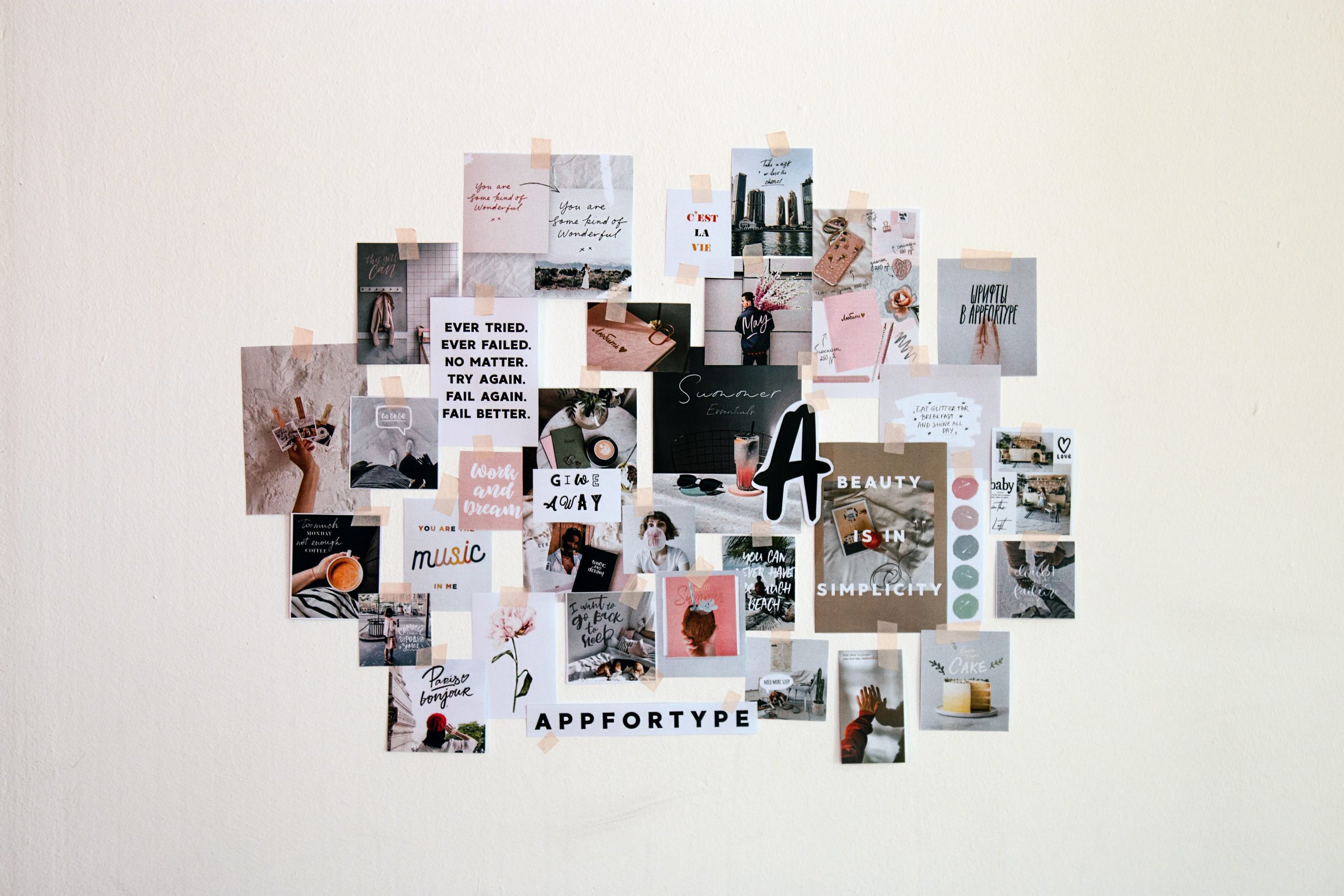
Mila is sharing her five tips on creating effective posters. Time to say goodbye to ugly, unappealing, full of only text posters!
I want you to imagine walking in an over-air-conditioned, loud, congested room with horrible lighting filled up with side-by-side posters with intricate titles and crammed text where one is more jam-packed and confusing than the next. All of a sudden, you see a visually attractive, attention-grabbing poster that is calling you to get closer and closer and urges you to stare at it for a little bit longer. In that appalling space, that poster just brightened your day and even awakened your curiosity to see if in that off-putting room there are other similar types of posters. Maybe that poster was not even in your area of expertise, but it was so enticing that you had to stop to take a look.
A poster is not a wall mounted copy of your last manuscript or your five-year project but rather an enticing and graphical representation of one particular, important aspect of your work.
I am a big fan of posters, but don’t get me wrong, I know posters are time-consuming and require skills and dedication and as much passion as writing that manuscript that probably took you months to complete. Maybe you are wondering how you get months or even years of research into a 48” X 36” poster. The reality is that you won’t be able and you shouldn’t try to. A poster is not a wall mounted copy of your last manuscript or your five-year project but rather an enticing and graphical representation of one particular, important aspect of your work. When done correctly, posters are a great mechanism to not only present research findings but also lessons learned and unique aspects of a project. Posters can also raise awareness of a problem or elevate an issue often overlooked.
A good poster can work in many ways. For example, a good poster serves as an advertisement and dissemination strategy for your area of work, as an effective way to increase your agency visibility, as a way to build new connections and make valuable contacts, and as a fast way to engage in meaningful conversation that could provide you with ideas for improving your work.
There are many things that one should know before developing a poster, but today I will share five things to keep in mind when creating a poster that I think will help you to get this process started.
Don’t sell your work but rather tell a story (well, actually show a story).
- REMEMBER, the poster is not your research paper, or your manuscript stuck on a board. It is merely a graphic display of your work.
- A good poster makes one and only one point. Your poster should tell or answer only one big question. Therefore, you should focus on one message.
- Select information that will help you to tell your story. Start by identifying between must have information versus nice to have. Only use details that are essential to get your point across.
Use a mixture of brief text mixed with visuals.
- I think this is probably the hardest one of all especially for those who are more comfortable explaining ideas through words or for those who have created posters in the past that simply rely on text. Identify which information you must present in words versus visual representation. Visuals can help you portraying complex concepts and entice people to ask questions.
- Balance the number of visuals and text across the entire poster. Avoid having images only in one side of the poster while text only in the other as readers will have to digest too much content at once.
- There are many ways that you can show information visually, some more effective than others, therefore, be mindful when selecting the type of graphs or figures you will include in the poster. Don’t make people guess what you are trying to share.
Make the information aesthetically pleasing.
- First, white space is your friend. You don’t have to fill up every inch of the poster with content. Think of the white space as opportunities for the readers to pause before moving to review the next section of your poster.
- Use color to engage your readers. Don’t make it so bright that the reader needs to get sunglasses to read your poster or so dark that they cannot see the content or they start feeling sleepy.
- Colors and fonts matter. If you don’t know what color or font to use, there are several pages on the web that can help you to decide on your brand and palette. If you have to create several posters a year, it might be worth learning how to use a color wheel and knowing the basics of complementary, monochromatic, and analogous schemes.
Make your poster eye-catching.
- Remember your poster will likely get placed in a poorly lighted room, so it is vital to make sure that everything that you include in the poster can be seen from 6 feet away. If the font is too small to read, fix it. If the graph is blurry, replace it.
- Create a logical flow. You don’t want the readers to have to guess how to read the information or even worst make them dizzy trying to figure out what all the abbreviations mean or which text corresponds to which table. Use headings when appropriate. If you are lucky, you will have 30 seconds to grab someone’s attention. If they are interested, they will stay longer, and you will be able to tell them about information that is not in your poster.
- Make sure all content has appropriate labels, a clearly defined legend, clear plot lines, and scales. A table without the appropriate labels doesn’t mean much. Eliminate anything that may detract from getting your message across.
Review and edit…and repeat.
- Don’t be afraid to create a sketch or storyboard and share it with somebody that is not part of your team. Make sure they understand your story and the flow of the poster.
- If the aspects of design (i.e., selecting a color palette, image composition, ) are not your forte, ask others to help you conceptualize.
- Print your poster before shipping it. You want to make sure that the colors are showing as you envision it, that the proportions are appropriate, and that you don’t have horrendous typos.
Let’s stop creating ugly, unappealing, full of only text posters, and let’s share our work in a way that is memorable and easy to digest. As Mary Helen Briscoe said “It takes intelligence, even brilliance, to condense and focus information into a clear, simple presentation that will be read and remembered. Ignorance and arrogance are shown in a crowded, complicated, hard-to-read poster.”


